Thursday, June 22, 2017

Project #3 -THE BRIDGE- Final Product (Lumion Environment + Animations)

Animations of Structure:

 (Tour of the Bridge)

 (Entrance #1, Tower #1)

 (Tower #2)

(Exterior of structure)

- PROJECT #3 - THE BRIDGE -

THEORY

Biomimicry transmogrifies a structure, by allowing the natural environment to permeate its form through the incorporation of light-weight, organic and sustainable components.

The structure encapsulates  Biomimicry as it mimics the functions of flowers through the opening and closing of the petals (or in the Architecture's case the expansion, contraction and overlapping of its 'skin'). Through this, the structure is able to open on cold days, allowing for sunlight to warm the interior or close on hot days, keeping the interior cool and comfortable.

The structure includes, lecture theatres,  tutorial rooms, a gallery, library, cafe, computer labs, a research space, workstation pods and a meeting room for staff.


Entrance via top of squarehouse

Birds eye view of Structure

Joined Library and Cafe

Cafe and Gallery

Computer Labs

Floor 2 foyer+ Public space

Entrance #2 via grassland beside the Squarehouse


Gallery and Cafe #2

Research Lab

Lecture Room

Floor 2, Tower #2 + Open  space

Floor 3 + Open space

Perspective of bridge cafe, gallery and library

Elevator from Ground Floor

Work  stations on Level 3

Perspective of bridge cafe, gallery and library #2


Staff meeting room

Moving Elements 1 and 2)

Moving Elements

The two moving elements are directly related to the concepts Biomimicry and Sustainability. The entire structure encapsulates many minor moving elements such as elevators, doors etc. However, contains two vital elements essential to the overall function of the structure.

The first moving element was captured using Grasshopper and depicts the 'Skin' of the tower structure Expanding, Contracting and Overlapping as a result of the Weather, brightness (sunlight) and Humidity.

(Moving element #1; occurring over the Tower structure, captured in Grasshopper)

Moving Element is similar, however occurs through a different method across the bridge. Whilst the function is the same, the existing structure, expands out like tendrils, covering or freeing the surface.

(Moving Element #2; occurring over the bridging structure,  captured in Rhino)

36 Custom Textures (Motion)
Motion Textures


The textures utilised in  the final structure are the following:

 Texture #1: From Synchronous
 Texture #2: From Synchronous

 Texture #3: From Fluidity


^ Word: Rotational ^
^ WordLinear ^ 
 ^ Custom word #1: Synchronous ^ 
 ^ WordScalar ^
 ^ Custom word #2: Oscillate ^
^ Custom word #3Fluidity ^


Draft Concepts (1, 2 and 3) + Feedback

Draft Concepts

I was unsure what design I wanted to pursue so I developed a few drafts and imported them into Lumion to visualise the structure and what the interior was like.

DRAFT #1:

(Exterior of 'Ring' structure)

(Interior of 'Ring' structure)

DRAFT #2:

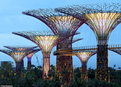
(Exterior of structure, inspired by Hanging Gardens, Singapore)


 (Interior of structure #2)

DRAFT #3:

I was still unsure about my concepts however time was running short so I began trying to implement more of my concept, Biomimicry throughout the structures looks and function. I also hadn't designed a bridge until now, so it was important I started conceptualising and visualising the Bridge element in the project.

(Exterior of Voronoi structure)

(Interior of the Voronoi structure)

(Bird's eye view of the Bridge spanning between the two towers)

(Perspective of the bridge)


Feedback:

I did not receive any peer feedback however gave feedback to two students. 

A Quick Plan

Planning


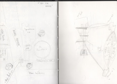
Before I began modelling any design I wanted to ensure I knew exactly how my model was to function and how it would integrate into the already existing infrastructure. I drafted up a quick floor plan of the area I was building and was inspired by the 'Hanging Gardens' in Singapore.
(Fig 1: Hanging Gardens in Singapore)

The idea of a 'Node' like structure where other structures connect to a central pylon was initially what I was going to design. However, doing so would mean that a very large shadow would be cast over buildings underneath, something that may be undesired by many. Hence why i tried to limit my design. The design on the left is a sketch of the major buildings found near the area of construction as well as a 'HUB' styled project. The right image depicts a parametric style tower connected via the essential part of the project, 'The Bridge'.


Expanding on the bridge idea I decided that the bridge should be more than just a scenic walk way. It should acquire some function, which is what the below sketch details, as well as its design. On the right hand side of the bubble at the top of the page depicts some type of bar/cafè structure and the left, plenty of seating and studying areas.


2 Point Perspective

2-Point Perspective


The 2-point perspective drawings were as challenging as the 1-point except required you to see through or rather accept the 'distortions' that were occasionally made as a result of the perception of each model.

(The models taken from 1-point perspectives and transformed into 2-point perspective.)


(Left: Model 1)
<-- 
(Right: Model 2)
--> 


(Below: 2-Point Perspective)

1 Point Perspective

1-Point Perspective


The one point perspectives to begin with were quite difficult to conjure even with the succour of a template model provided by our tutors. This was due to the distortions that could potentially be created depending on the positioning of the vanishing points and the model itself. However, after a few attempts I began to play around with a few designs and really tried to encapsulate the notions of light-weight and permeable structures.